Figure 1
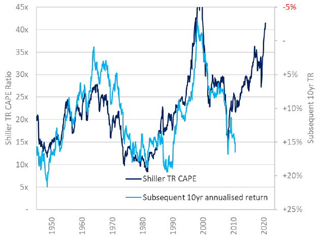
Figure 2
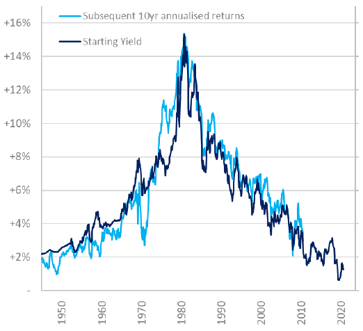
Pulling the bond and equity sides together, we can look at the excess yield that an inverse CAPE ratio – ie, the cyclically-adjusted earnings yield – offers in excess of US Treasuries. The way that this relates to subsequent 10-year returns in Figure 3 looks sketchier than Figure 1. Moreover, it doesn’t explain some of the wild swings – the period that captures investing at the height of the dotcom boom and cashing out in the depths of the global financial crisis, or the post-GFC boom that captures investing in the depths of the GFC itself and cashing out around now. But I don’t think it is an unreasonable way to think about the impact of valuation on longish-term return horizons. Through this lens, excess returns “promised” by equities versus bonds are middling-to-attractive. But on a low absolute bond base.
Figure 3
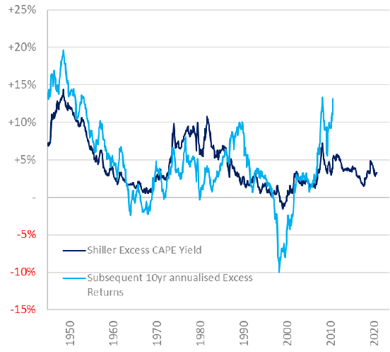
Figure 4
Where does that leave us today?